Once I had the colours and the yarn for this project, I had to decide on which blocks to make, and with which colours, and then how many of each block and how to lay out the whole blanket! Suddenly this was feeling a bit overwhelming, but I pushed through, trying to focus on one thing at a time.
Selecting the Blocks
I pulled out my trusty 200 Crochet Blocks book (I've made such good use of that book!), and immediately decided on a few favourite blocks from the group project - particularly the Into the Blue (the blue concentric circles below), Fretwork (the bright blue and green and brown granny-square one below), and Begonia (the brown and green one with a flower in the centre below) patterns.
Next I searched through the book for a couple of blocks that would go well with those three. I decided on Willow (the two-tone green one below), and Ziz-zag Bobbles (the striped one).
Designing the Layout
I took a picture of each of the squares from the pattern book, and loaded them into Powerpoint, and played around with them, creating a few different designs to see what might work. I knew these wouldn't be the final colours, but it was something to start with.
Design #1 is a sort of checkerboard pattern, pretty straight forward and balanced.


Design #3 is inspired by a picture frame.

Selecting Colours for the Blocks
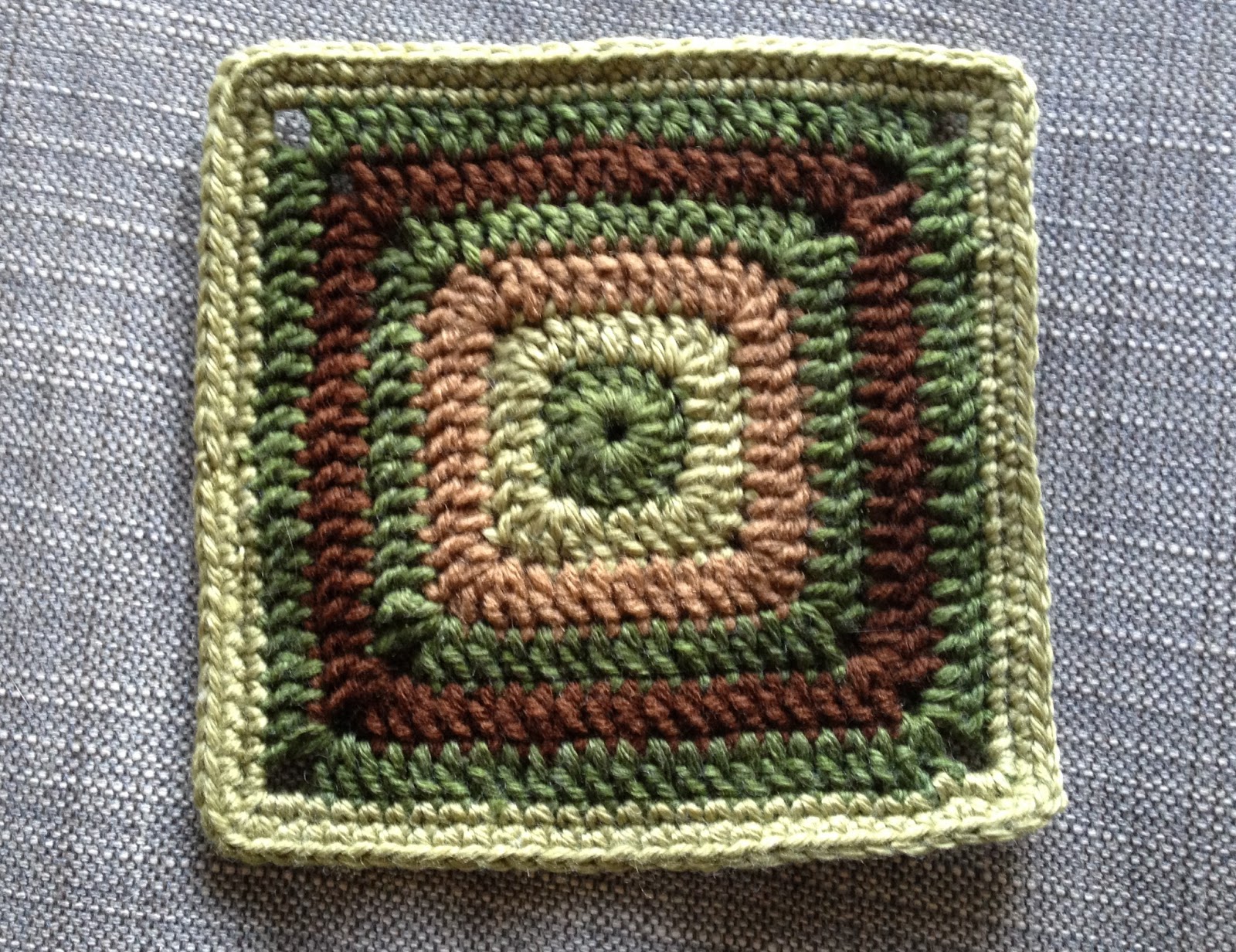
I started with the Begonia pattern (see below), which has always been my favourite. I tried to replicate the colour scheme in the book, but my first two tries both fell flat (see first and second below). My colours were too different from those in the book, and the greens were too much of a contrast. So after consulting with my mother-in-law, I came up with the design on the right, which I was quite pleased with. It gives the earthy effect I was hoping for, and it includes those little punches of bright orange and green to liven things up a bit.

Here's the final result (same as on the right above, but better lighting) - I have a feeling this one will be my favourite block...

Next I started on colours for the "Into the Blue" block - which should probably be re-named as "into the green" or "into the earth" with this colour scheme - and again ran into the problem of the bright green and dark green being so different that the effect is jarring.


Thankfully the other squares went more smoothly overall.
For the Fretwork square I again tried to match the colours from the original pattern, this time with much more success. the only glitch was that it turns out that the beautiful bright blue is a much lighter weight yarn than the rest - I think it is closer to sock weight that worsted! So I ended up using two strands together and a slightly smaller hook for that part of the pattern. It was such a relief to have it work out the first time!


The last block was the one I was least excited to make - unlike the other four (which are made in the round, and with mostly double crochet stitches), this one is made in rows, of almost entirely single crochet. That means it's painfully slow to make in comparison! I knew I wanted this square to include the orange (the bride's favourite colour), and probably green and brown - but which green and which brown should I use? I experimented with several combinations, including using the orange for one of the larger sections, and pink for the stripes, but I finally settled for this combination, with the lighter brown, the "darker medium" green, and of course the orange for those highlight stripes.
The other annoying thing about making this square was getting the sizing right. It kept coming out too thin and tall. I tried taking out a row or two, but because of the 3 sections of this pattern, I had to take out 6 rows to keep the section even - one on each end of each wide stripe. But then I had an incredibly short and fat square instead, and the pattern was all distorted. So much for that idea! Instead I tried playing around with my tension and hook size. Did I mention that the brown was a bit thicker than the others, and the orange was a bit thinner? That made things even more complex. Finally I seemed to find a combination that worked - but every time I tried it, it seemed to come out a little differently. Oh well, I guess I'll just have to try my best with this one, and try blocking it at the end...?

Ok, so now I had four blocks sorted out, and one almost finished (the "Into the Blue" block that I was still not quite happy with above). Here are the blocks all together so far. Looking pretty good, except for that bright green centre on the Into the Blue block; that definitely had to go.

Instead of making a whole new square to try something new, I made a new centre (using the lighter medium green) and laid it on top of the already-made square. Ah-ha! I think that will do it.

And here is the finished square - finally!
The five final blocks - at last!


The arrangement of the other four squares in the above design was a bit complicated, so I decided to keep it simple and use a diagonal line of each of the five squares. Of course this plan calls for 77 blocks (7 x 11) - time to take a deep breath and get started!
Unfortunately now that I've got this finally figured out, we need to start packing for the big move. I'll have to pack up most of my yarn, but leave out enough of each colour to keep me going on the road.
That's it for now, keep crafting!
No comments:
Post a Comment